shaun
Jeff Speakman

Posts: 195
|
Post by shaun on Mar 31, 2008 6:33:53 GMT -5
Inspired by a comment from Fake Mustache, on how MGM missed out on using a great cover for 'An Eye For An Eye' on it's DVD release. I personally think standards are dropping, go and look through your old VHS collections, you'll find films with great artwork, that grab your attention. However that's not the case with a lot of DVD's, let's look at some examples, 'Live and Let Die' poster (also used on several VHS sleeves)  now look at the two DVD releases (MGM again)   Terrible! You've all seen this great poster before  This is what we got on DVD  Horrible! Feel free to post bad examples of horrid DVD art. |
|
|
|
Post by MacReady on Mar 31, 2008 8:23:18 GMT -5
Cool thread idea.    Those two are terrible, I`m sure there`s worse about though. |
|
|
|
|
|
Post by milo on Mar 31, 2008 9:37:55 GMT -5
 This looks like something even I could photoshop  |
|
|
|
Post by vigilante on Mar 31, 2008 13:21:26 GMT -5
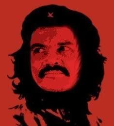
Just like the Seagal examples, a few pounds of fat seem to have been shaved of Tom Hanks' neck & chin....  Just for the record....I don't own this movie. |
|
|
|
Post by Voelkermord on Apr 1, 2008 23:07:21 GMT -5
My Mom does, she watched it all the time.
|
|
|
|
Post by Colonel John Matrix on Apr 2, 2008 15:39:59 GMT -5
I watched it on a flight once  It was before I'd even seen Commando, okay?! I didn't know what I was doing! I agree that they're using crappy photoshopped posters and DVD covers these days. I'm glad at least that the posters for the new Indy movie kept the same classic hand-drawn look. |
|